Explorer Hubs
Explorer Hubs
Project Overview
Team size: 7
My Role: Lead Designer & Researcher
Project Impact: To be determined; it has not yet launched (based on prototype feedback, it will increase repeat visitors and increase findability of hubs)
My Favorite Part: Find all the ways to link data that exists in Salesforce to our site in a way that's valuable and reliable for Society staff and Explorers
Problem
National Geographic Sociey offers Explorers ways to connect with people who live or work in their region through Explorer hubs. Information about these hubs was scattered online, wasn't consistent from source to source, and ultimately made it more difficult for Explorers to connect with each other. In interviews, Explorers said that their main complaints involved the difficulty learning about the hubs, especially:
When new users join
Who the leaders are
What a hub is
How to participate
What other hubs are doing
Hub events
Our team wanted to improve the hub experience by making it easier to find the information, making it easy to join/leave a hub, and helping Explorers answer their questions without having to contact us.
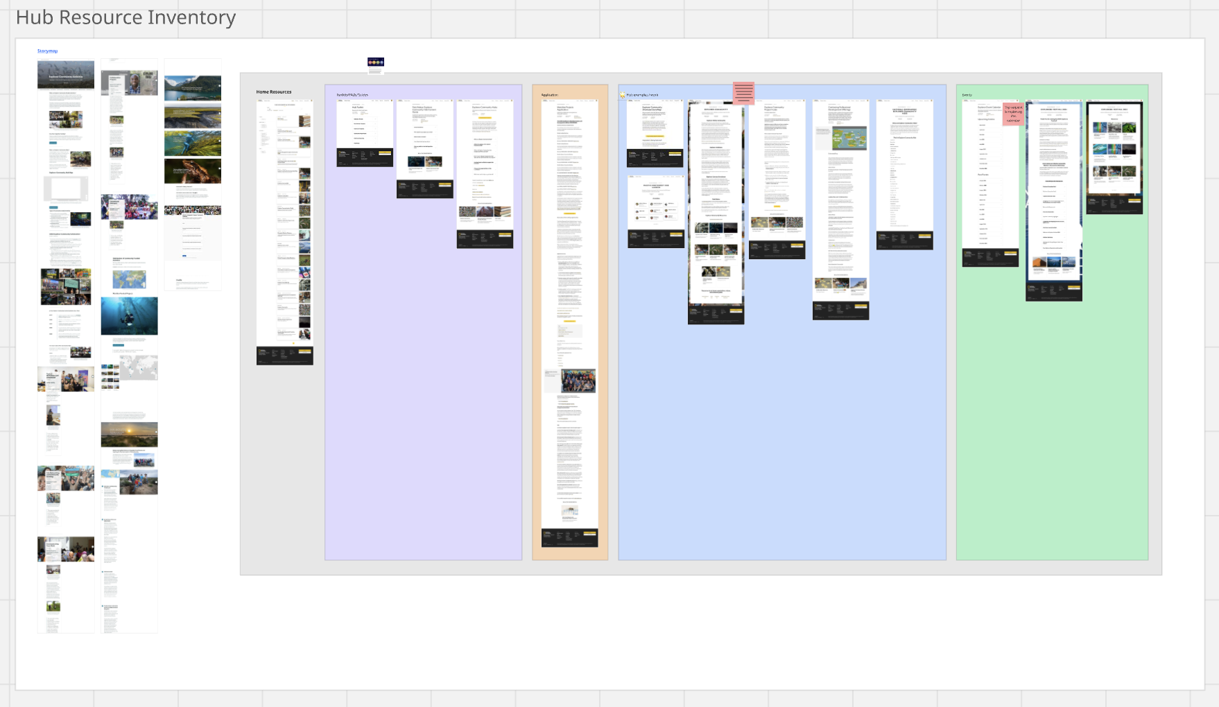
Cataloging Existing Content
The first step involved cataloging existing hub-related content. Below you can see the how much information was online, grouped by where it could be found. We also used this board to highlight areas of redundancy so we could work with the content teams to remove and rewrite some of the existing resources.
What's not shown are screenshots of every single hub page, which were available on a website that Explorers often don't know about. The individual pages were left out of date and resulted in confusion. Ultimately we decided that every hub should get it's own page on our Explorer portal. This meant it also needed to be worked into our search engine so we could improve findability. It also meant we needed a way to link to existing content about the hubs (when relevant) and a new way to display a hub on our site (with a new card).
Mapping the Interactions
Next, we mapped all of the interactions that would be important for Explorers to do on the new page. For example, a new Explorer should be able to easily join a hub from its page, so that interaction was mapped with callouts about what backend systems would be required to support the data. We also had to think about interactions that happen off the page, like email notifications that verify that the Explorer successfully joined a hub.
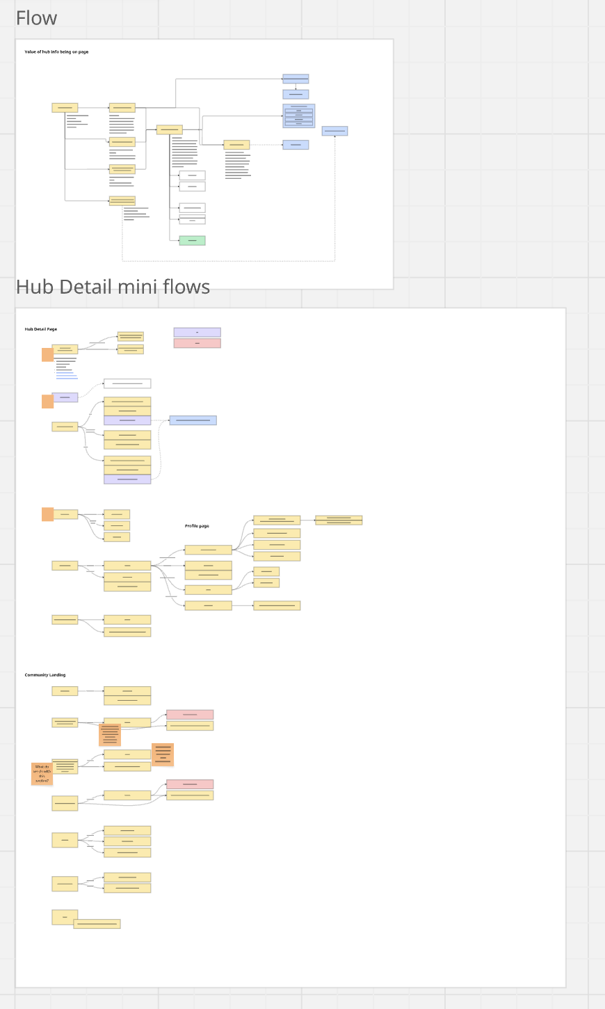
To better understand where we could improve the experience, I mapped the existing journey of joining a hub, and highlighted all the areas where there were pain points.
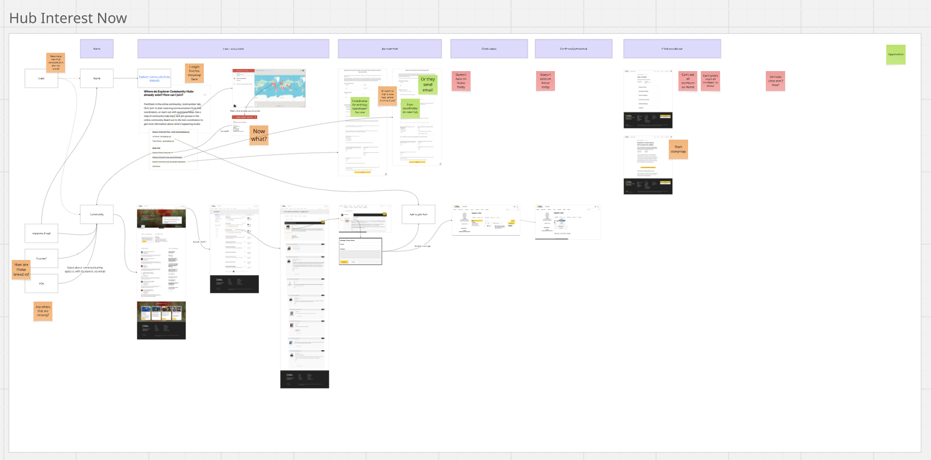
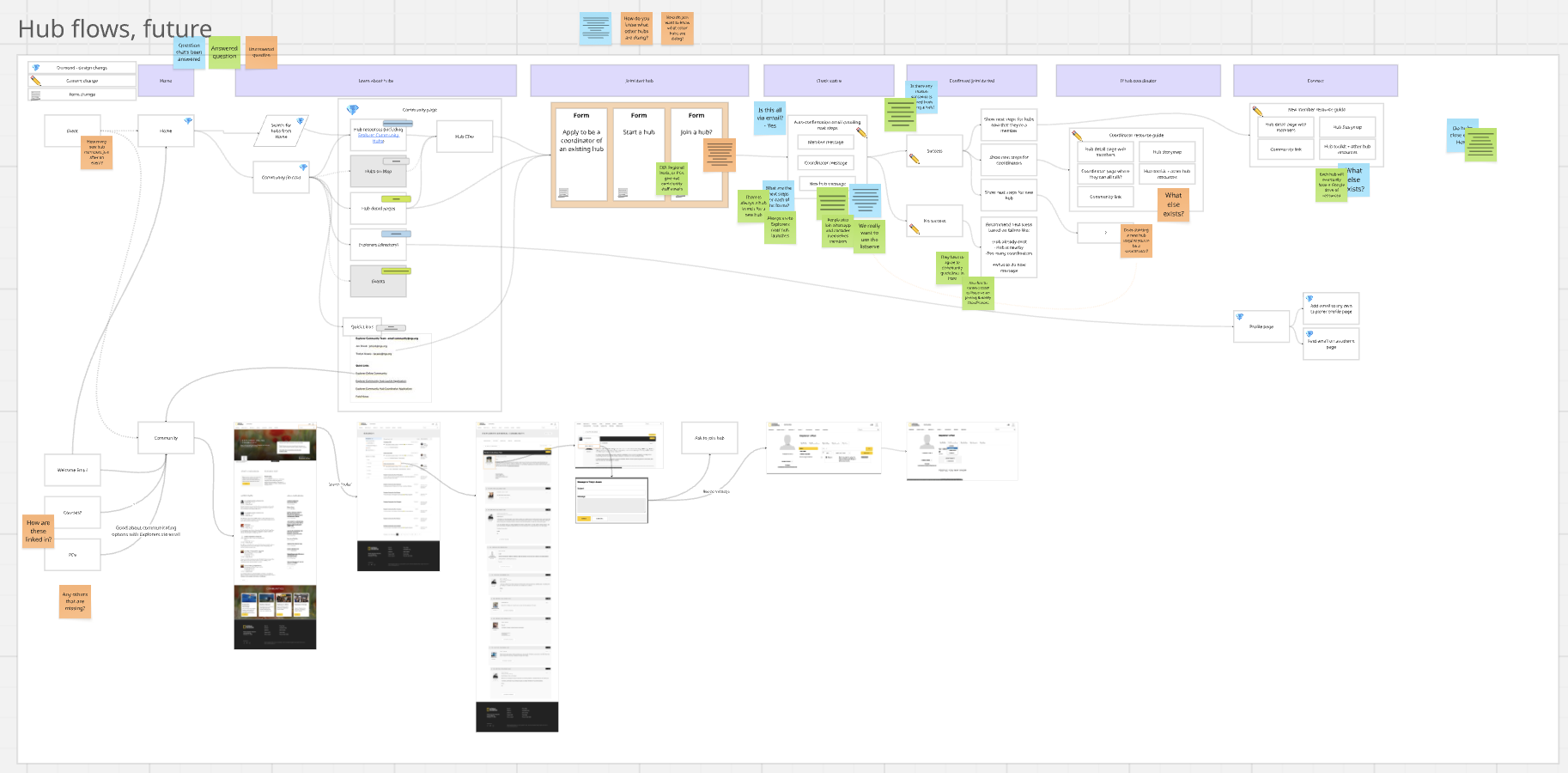
I then mapped a new journey that addressed the pain points and would help Explorers get exactly what they needed when they needed it.
Feature Prioritization
In this process, our team brainstormed a lot of new features. We couldn't address them all, so I used our information from past interviews to suggest priorities. As I began the wireframes, I color coded the sections based on the priorities (green would be first).
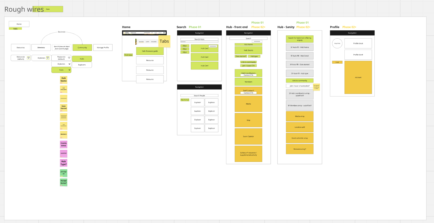
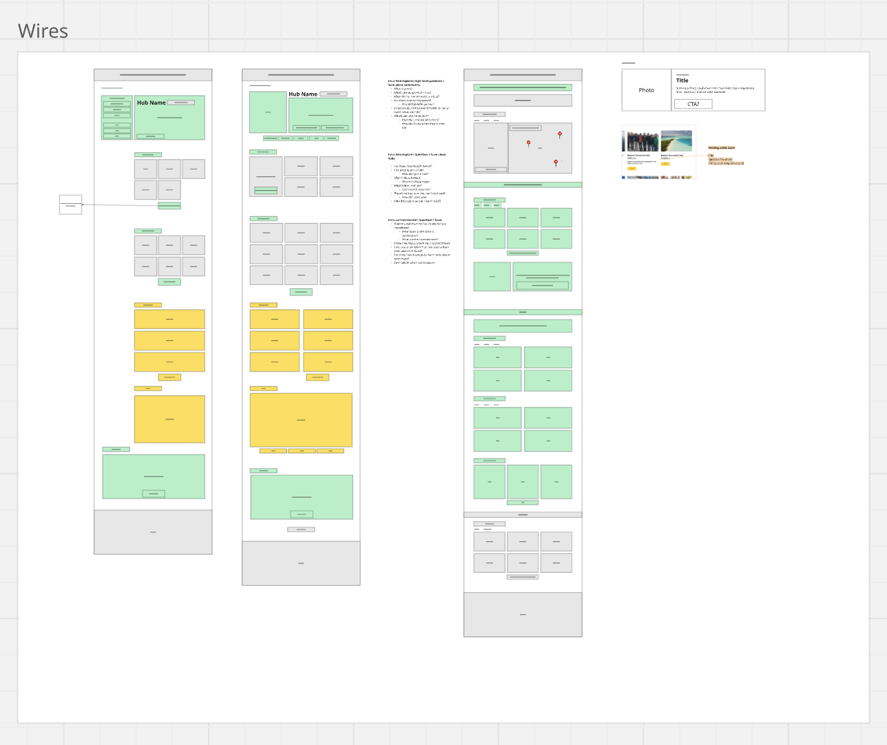
Wireframes with Data Mapping
The color-coding remained in the wireframes. I find this to be really important because, even if the design can't be done all at once, I never want to leave something behind simply because the design wasn't considered holistically. Even though we new we wouldn't be able to finish the orange and yellow items within the first phase of the project, I wanted them to be easy to add later. If they had been left out of the wires, we would have risked having to redesign the entire page to fit them in later.
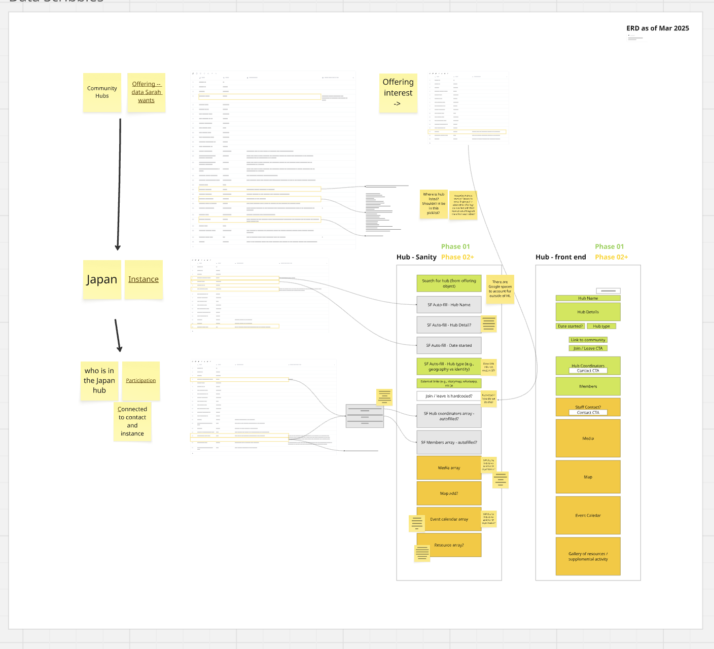
It was also important that the things we focused on first were feasible in our timeline. I worked closely with our product manager and the data team to ensure that we could successfully link existing data to the areas that needed it on the page. One example of this is using the fields from Salesforce that populate hub leader names and automating it on our front end. Since we use a CMS (Sanity) to create the hub pages, we wanted as much as possible to be automated. That way, if a hub page pulls the hub name from Salesforce, it can also pull all of that hub's information automatically into the page (hub leaders, hub members, contact information, events, etc.). This means it stays as up-to-date as Salesforce, saving content creators valuable time.
User Feedback
I worked with the community team at National Geographic to help organize three online virtual meetings with hub leaders from around the world. In the meeting, I asked users to open the prototype and provide feedback. Overall, they liked the initial prototype but had great insights into more features that could be helpful for them, like adding places on a hub's page where leaders could link to internal hub documents (like a google drive link or a Miro board). I also got feedback on how they'd like to organize events from the page, and how to have better notifications when new members joined.
To address this, I designed in a way for them to add their own links to the page that could only be visible to users who were already a part of the hub. For example, an Explorer who isn't a part of a hub would not see the WhatsApp group number until they joined the hub and were authenticated into the experience.
While the events section of hubs was one of the features that was put in yellow because of the timeline, I did want to give Explorers and easier way to know if new Explorers joined. We did this by linking the Join button to Salesforce. When an Explorer joins a hub, they're added to Salesforce and Salesforce automates a message to the leader. We also updated our Hub Members section to be searchable on the page (with live updates as the user types) and show the number of current members.
Final Design
The designs were finalized and handed off in late 2025. They are not yet in production so I am unable to share images online. Please reach out for more information.