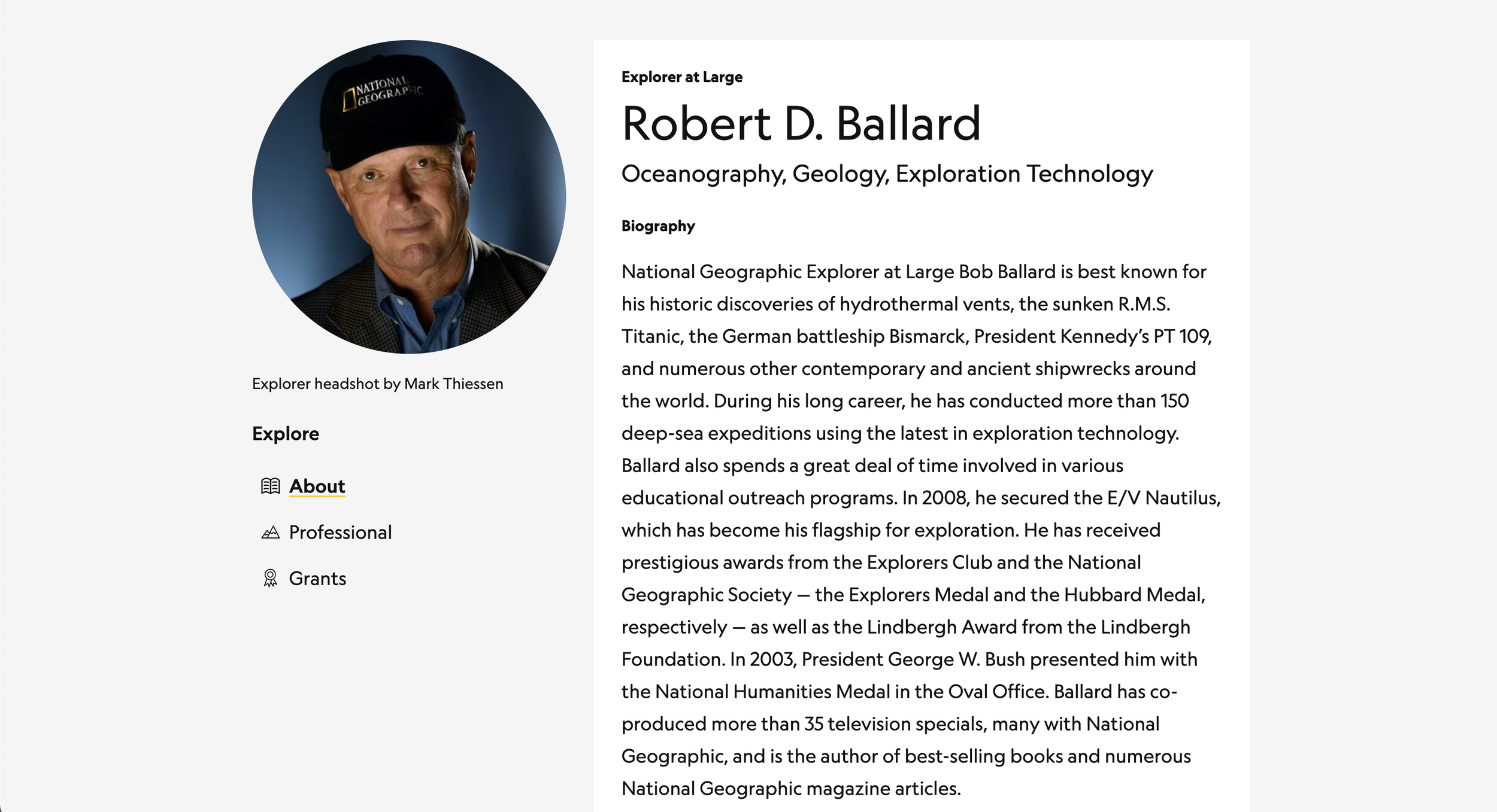
National Geographic Explorer Profile Page
National Geographic Explorer Profile Page
Project Overview
Team size: 8
My Role: Designer & Researcher
Project Impact: Better search experience, better UX standards (especially clear, findable, communicative across user types)
My Favorite Part: Talking with Explorers about how they wanted to use the site to better connect with others
Problem
National Geographic Society grantees (Explorers) have dedicated profile pages in the Explorer portal. The old design had been around for a year and the feedback from Explorers and Society staff was pretty negative. The primary complaints:
Searching for Explorers was difficult with limited filters and when Explorers didn't have profile photos
The grant section of the profile didn't have the most relevant information
When the relevant data was shown, it was often erroneous
Sharing the profile was difficult because signed in Explorers could see more information than the general public
Navigating the page was difficult
Editing the profile was confusing and, ultimately, not worth the time it took to do (leaving profiles out of date)
Research - User interviews
This project took two separate user research sessions: one for Society staff and one for Explorers. First, we interviews Society staff to document their concerns and better understand what kind of data they were looking for on an Explorer's profile. We also sat down with our Salesforce and Communications teams to discuss what kinds of data we were allowed to show.
Constituent Differences = Different Views
The answer to that turned out to be more complex than we were expecting, because the data depended on the user. Public users could see certain information (like the bio and photo), Explorers could see more information (like social media links), and staff had the most access (and were able to see things like grant details). This meant our designs had to consider all types of users, so every frame in Figma was developed with 4 views:
Staff-only view
Explorer view, if the user was an Explorer viewing their own profile (with the ability to input and edit data)
Explorer view, if the user was and Explorer viewing another Explorer's profile
Public view
And each of these had to be designed for multiple screen sizes. We also had to work closely with the data team to ensure that the user could be properly authenticated into their own experience.
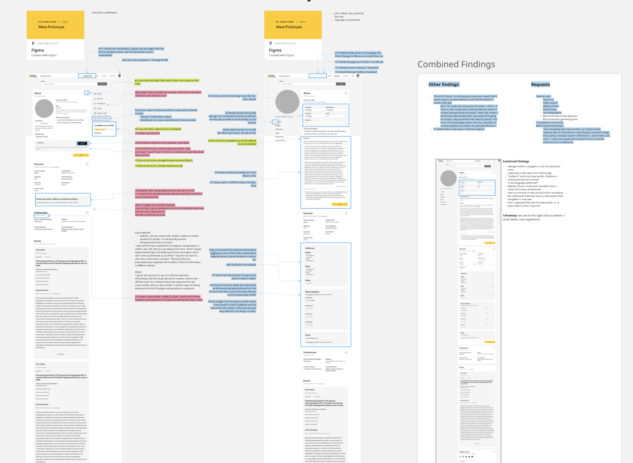
Research - Usability Testing
I met with Explorers virtually to A/B test the new design. I documented the findings in Airtable to share with stakeholders but found that the visual stakeholders were more responsive to Miro. With that in mind, I created the board below, copying in the designs and color-coding responses. We learned that the second version of our design was preferred, but there were still some areas that needed work, particularly around data.
With this information, our team sat down with the data team to work out how to ensure that the right data was getting through to the page and could be easily edited from the frontend site in a way that would reliably write back to the relevant field in Salesforce.
Design Refinement
After the comments were addressed, we had our new design. We:
Added a search bar on every profile to make searching easier. This feature also auto-suggested information as the user types, making it even faster to get where they need and replicating a pattern that most search functions follow on other sites
Updated the grant section for staff so they could find more relevant information
Updated the connections to Salesforce so that the correct data was being pulled and we added the ability for staff and Explorers to contact Nat Geo to correct erroneous information
Included a visibility indicator to tell the user who had visibility into each section (e.g., "This section is visible to all Explorers" or "This section is only visible to you")
Added a sticky scroll spy so that users could jump around the page quickly
Created a much more streamlined and clear way for Explorers to edit their own profiles
Final Project
Since launch, the changes on the site resulted in a significant decrease in profile-related service requests. Explorers now have the ability to change their own data when they see that it's incorrect or out of date, and staff are now able to find all of the information they need.